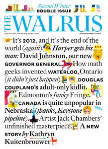
Earlier this spring, as the RRJ was designing its cover for the Spring 2017 issue—which is launching April 6—we decided to interview some art directors from well-known Canadian publications and pick their brains about how they create their covers (we’ve already picked Valerie Thai’s, art director of This magazine). Brian Morgan has been the art director at The Walrus since 2008, and has continued the magazine’s streak of wins and honourable mentions in art categories at the National Magazine Awards. We thought he’d be an insightful interview, and get in touch via email.
What’s your process for designing a cover?
That’s a big question because I’m not the only cook in the kitchen, so the process is very complex. With some rare exceptions (e.g. David Carson), most covers are a team affair. In our case, a number of people are involved, and amongst the group there are a lot of different, and contradictory, theories about what works on the newsstand, and why.
In a generic design process you’d establish the brief, gather information (needs, competitive set, research, inspiration), then use that to create enough ideas that there will be good ones left after you cull. You use critique to make sure that you haven’t gotten off track, or missed other fruitful paths. But there is a lot of input, and it’s not always about “needs” or “parameters”. It’s about consensus. As well, the object of the process—the story or idea we’re selling—is frequently in flux. Editing and fact-checking problems can easily bump, and sometimes kill, a piece, and mix considerations can push some pieces out and revive others. The lines, too, are subject to constant debate, and change frequently, as people inside and outside the formal process grapple with be best way to say what we want. Lines change the framing of the image—they’re its caption, in effect—outside of any layout issues to do with length.
Because of the unpredictability, I tend to do lots of little thumbnails, or even just write a line or two, in my sketchbook, and pile up ideas while I wait for things to settle down. I weed these, make mock ups, and weed again.
The thing I ask myself is what is the idea behind the cover story (or groups of stories), and then how best to sell this. While I’m sketching I’ll of course read all the pieces, and do some image and inspiration research, both to get my mind around what this could look like, and to start thinking about who could do this.
One of the nice things about being at The Walrus is that it has a long history—one that goes back to the third cover—of using illustration. There was a time, within my career, when this was seldom done, but I’m happy that we’ve always had that flexibility. Not every story lends itself to a photo, or a type treatment. Illustration is very good for speaking to abstract concepts. It’s good to have three legs on our stool.
How do you go about curating or creating cover images?
For the cover I fan out onto the internet, searching fine art gallery sites and stock sites equally, looking for inspiration, but I put a lot of thought into who can do it. I’m looking for someone who will have a new, strong take on whatever we have, will be able to grasp the story, but who will also be able to deal with the many twists and turns that our process delivers.

There are many classes of subjects for which an illustration, just because of the control involved, will express better than a photograph, or the same idea shot would look silly. With photographs, because of their connection to the real world, you get a paradox of control: the more you want an image to turn out a particular way the more it will cost. Lighting, studio rental, post;all things that an illustrator can do from a blank sheet.
It’s not always possible on the cover, but I am much more interested in what the contributor thinks, than whatever ideas I come up with. If possible, I really want to have the space for the illustrator or photographer to find their own way through the subject. The results are more interesting that way.
What’s your favourite part of your job?
I get to work with a lot of very smart, very cool, very savvy, and very lovely people at The Walrus. My design team is wonderful: Meredith Holigroski and Paul Kim are super talented, and I could trust my life to them. I also get to work with a wide range of visual contributors, who we get to do all sorts of interesting things for us.
Aside from yourself, who’s your favourite art director in the world of magazines?
Well, I’m not my favourite art director! I am a huge fan of the smart and sassy fun that Richard Turley and Robert Vargas made—and Vargas still makes—at Bloomberg Businessweek, and in that vein the work of Javier Errea, Lucie Lacava, and Francesco Franchi. The work of M&M Paris and Büro Mirko Borsche is both excellent, as is Mainstudio (I’m a big fan of Mark), and of course Gilbert Li and Underline (Prefix Photo). I love Mousse (Francesco Valtolina). And there’s the mighty Karel Martens (OASE) and the late Tibor Kalman (Colors).
Any muses that aid in your creative process?
I have a reasonable library which I consult regularly, and when I can steal a moment I shop for books and magazines. I live in Montreal, where we’re blessed with not one but four media streams—English Canada, French Canada, the U.S., and France. Where else can I pick up Nouveau Project and Hors-Série Télérama?
What is your favourite cover you’ve designed?
We did a riff on a George Lois Esquire cover, with the brilliant Genevieve Simms, which turned out very well. I love working with her!