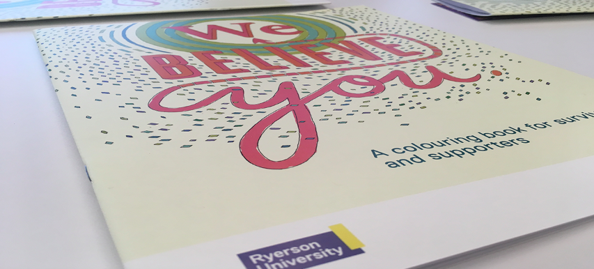
There’s a common phrase saying that a picture is worth a thousand words. RRJ instructor Stephen Trumper says that a picture is worth nearly ten thousand. An image works with the text to tell a complete story—and sometimes, it does most of the heavy lifting. Take the piece I wrote to work alongside Devin Jones’s photography showing the demolition of the old Now Magazine building: my words would have meant very little without Jones’s pictures.
As the RRJ’s display editor, part of my job is to work with the print crew, our art director David Donald, and the visual team to create the cover that will attract as many people as possible. The biggest part of my job is working with the visual team and our in-house artists and photographers to find the best images for our content.
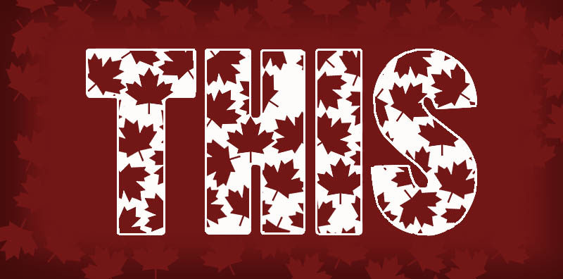
This year, due to the amount of sensational stories our writers have finished, we had an honest-to-goodness difficult time choosing which one will be on the cover. So, as we worked on ours, we reached out to professional art directors to talk about their careers and creative processes. First up is Valerie Thai, art director of This Magazine.
Sarah Desabrais: What is your process for designing a cover?
Valerie Thai, This Magazine: First, I meet with the editor and publisher to discuss whether there is a theme for the upcoming issue. If there is no theme for the issue, then we try to relate the cover to one of the main features. From there I will start drafting up different concepts/ideas that could possibly work as covers. Then, collectively, we usually decide on a direction, or refine it. Once the idea has been approved, it moves on to production and design. During the design process, it will still undergo multiple reiterations to get it just right.
How do you go about creating your images? e.g., photographs, illustrations . . .
Some of our images are created/assigned to Canadian illustrators and/or photographers, which will then get laid out as the cover on our end. Other times, we create the images in-house. We try and pick the medium that will fit the cover concept best. The creative process really varies from cover to cover since we don’t adhere to one strict cover medium—sometimes it is illustration, sometimes it is collage, or photography, and sometimes it is purely typography.
What is your favourite part about your job?
I love the design process itself and the challenges that can come with it. I also love working with other illustrators and photographers and being able to be creative at my job and connected to the arts and design community. I think the best part is being able to create design that is meaningful and that can speak for several social causes. It is design with meaning and purpose.
Aside from yourself, who is your favourite art director in the world of magazines?
I don’t know if I just have one favourite . . . there are so many talented art directors. I admire Paula Scher (Pentagram) for paving the way in what once was a very all boys club in the print design industry. I am thankful to Chris Dixon (Vanity Fair and past Adbusters art director) and Tom Brown, who gave me my design break and taught me a lot about magazine design when I was first starting out. Others to throw into the mix: Steven Heller, Chip Kidd, Jonathan Barnbrook . . . again, too many to choose from.
Any muses that aid in your creative process?
I get creative inspiration from all over—art, music, pop culture, environment. But I guess if I had to pick muses, they would be my two young sons, Jasper (6) and Cedar (3). They always have fresh eyes on everything and make me look at things in different ways.
What is your favourite cover you have ever designed?
For This Magazine, my favourite cover would have to be the Nov/Dec 2016 cover. It was a commentary on how the current Canadian media is too in-love with Justin Trudeau. For the concept, we decided to make it look like a classic teen magazine. It was fun creating a design in a style that I normally would never work in.
My favourite cover ever though would still be Adbusters May/June 2004. The theme of the issue was the rewriting of American history, and its historical dark sides that tend to get glossed-over. The cover was designed to look like a classic history book, but with a twist. I think it still holds up pretty well to this day.

